I've noticed some bloggers redesigned their sites using very dark backgrounds and the results are often very cool. The thing is that the forms also have dark backgrounds and, in order to be readable, light colour fonts.
The problem I saw is that form auto-fillers such as the Google toolbar, paint the fields they think they know about in some shade of yellow. As a result, white font on yellow background is next to unreadable.
Dustin Diaz's blog was recently redisigned.
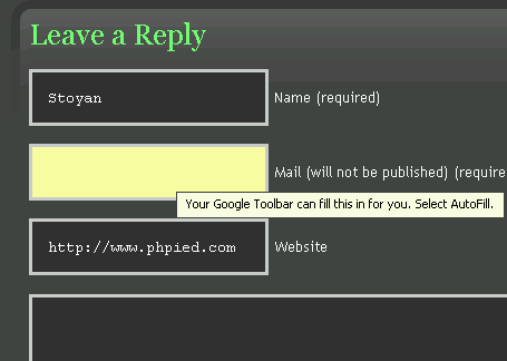
The form with the tooltip from the offending auto-fill thing.
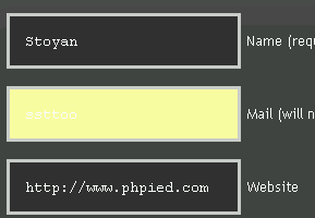
What's my email?
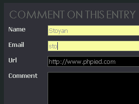
Also Marco has done a great job redesigning his site. In his case the font is a shade of gray, so the text is more readable, but still not too contrast.
How to resolve the issue? Trying to find a one-colour-fits-all-auti-fillers may be hard, but maybe trying to keep the form fields' background as light as possible is a safer way to go.
Comments? Find me on BlueSky, Mastodon, LinkedIn, Threads, Twitter