So next step after the sexy CSS lexer is parsing. But first - railroad diagrams to help visualize how/when the tokens make sense forming valid CSS code.
Below is what I have so far. It includes pretty much everything except selectors. Selectors are getting increasingly complex, come to think of it.
There are probably mistakes in these diagrams, so I'll be happy to see any cases where they don't work properly.
Here's the list of png images and the powerpoint file I used to make them, in case you want to use (or correct) the diagrams for your own purposes.
Stylesheet
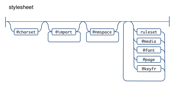
A stylesheet can have an optional charset, followed by zero or more imports, then zero or more namespace definitions. I struggled a bit whether I want my parser to support namespaces, because I don't think they are widely used, nor exceptionally helpful, but webkit supports them since quite a while, so, heck, let there be namespaces, although they make everything more complex. No wonder JavaScript still doesn't have (or plans for) namespaces.
So after these intro @-rules, there could be any number or combination of rulesets, @font-face, @page, @media and @keyframes, in any order.
@charset
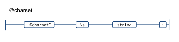
Pretty simple, just the literal @charset followed by a string. It has to be the first thing in the CSS file and there can only be one.
E.g.
@charset "UTF-8";
@import
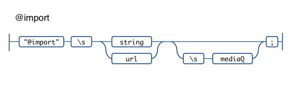
Any number of imports follow the charset, they can define the URL of the imported CSS as a string or using url(). There's an optional media identifier (in CSS2) turned media query (CSS3). In other words these are all valid:
@import "stuff.css";
@import url(stuff.css);
@import url(stuff.css) print, handheld;
@import url(stuff.css) screen and (color);
@import "stuff.css" screen and (color), projection and (min-color: 256);
Ah, media query syntax, lovely.
@namespace
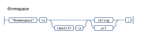
Namespaces (arrgh!) are innocent-looking to declare:
@namespace svg "http://www.w3.org/2000/svg";
@namespace svg url(http://www.w3.org/2000/svg);
@namespace "http://example.org";
@namespace empty "";
@namespace "";
@keyframe
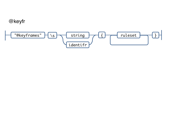
Horray for more @-rules. This one is pretty cool actually, has been working well in WebKit (I've used it) via @-webkit-keyframe and allows us to take serious amounts of animation-related code out of JS.
@keyframes 'diagonal-slide' {
  from {
    left: 0;
    top: 0;
  }
  to {
    left: 100px;
    top: 100px;
  }
}
@media
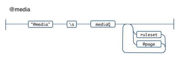
We've all used stuff like @media print {.banner {display: none}} for quite a while, but things are getting complex these days with the media queries and the ability to nest @page blocks (which can have blocks of their own). Hairier and hairier.
@media screen {
  margin: 20px;
}
@media print and (color), projection and (device-aspect-ratio: 16/9) {
  @page :left {
    @bottom-left-corner {
      margin: 2cm;
    }
  }
}
Media query
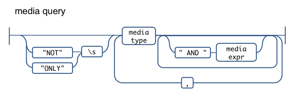
Media queries can get a little scary. In their simplest form they can just be the media type. One of:
aural
braille
handheld
print
projection
screen
tty
tv
embossed
speech
all
(The fact that "all" is also optional makes me think there's a problem with this specific diagram but makes my head hurt. And nose bleed.)
So, simple:
@media print {...}
Or:
@media print, screen, handheld {...}
But you can be more specific, using AND and providing more details about the media type using the so-called media expressions.
@media handheld AND (orientation: portrait) {...}
Then you can negate the whole query with NOT and hide from old browsers with ONLY.
In fact this is pretty popular way to style for iPhone:
@media only screen and (max-device-width: 480px) {
  #bigbanner {
    display: none;
  }
}
You can also keep adding AND expressions and be really picky about the type of device and the features it supports
Media expression
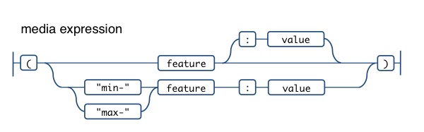
The media expressions (not to be confused with IE's expression() value) are wrapped in parentheses and can be:
- just the feature, e.g.
(color) - feature plus specific value for it, e.g.
(orientation: portrait) - min or max value for a feature, e.g.
(min-width: 100px). When there's min/max prefix, the value is required
The feature can be one of:
width
height
device-width
device-height
orientation
aspect-ratio
device-aspect-ratio
color
color-index
monochrome
resolution
scan
grid
Those in italics don't support min- and max- prefixes
Ruleset
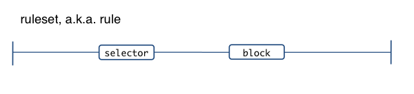
Whew, finally something that looks normal - the old:
#mydiv {
  color: red
}
Of course, selectors are complicated, I'll deal with them in a later post.
I've moved the property: value declarations into something I called "block" since it occurs not only in rulesets.
Block
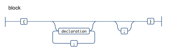
Any number of property: value pairs (a.k.a. declarations), delimited by a ; and wrapped in curly braces.
Declaration
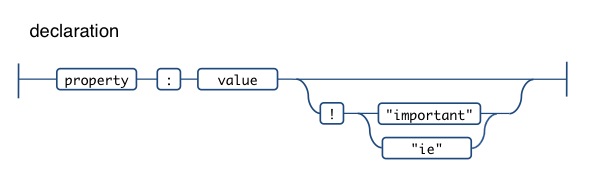
The plain old property: value pairs.
What the allowed values are, depends on the property. And what the property is, depends on the type of block. Blocks will be reused, for example in @keyframe and @font-face where for example there's a src property, which doesn't make sense in a normal #mydiv {} block.
You can see that I've decided my parser to allow !important as well as !ie. Since IE treats anything after ! as if it was !important, this is a common hack to make something important for IE only. This is the type of thing that I'd like to have that allows real-life validation. And why !ie and not just random !noodles? Well, !ie hints the intent and is more maintainable, where allowing anything including !importent (probably a mistype) is not too validaty and helpful.
@font-face
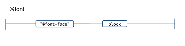
The @font-face. Nothing overly exciting actually.
@page and page blocks
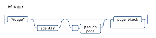
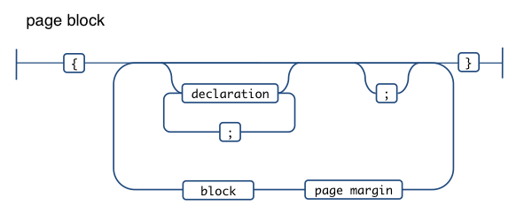
This one can become complex too, but heck, it allows us to style content for book publishing! In a worst case scenario it could have three levels of nested blocks.
The thing is that inside of a normal property: value block there can be nested ruleset-like constructs (only instead of selector, there's a page margin)
@media print {
  @page mine :left {
    margin: 1cm;
    @bottom-left-corner {
      margin: 2cm;
    }
  }
}

/* or something simpler */
@page {
  size: A4 landscape;
}
The page margins allowed are:
@top-left-corner
@top-left
@top-center
@top-right
@top-right-corner
@bottom-left-corner
@bottom-left
@bottom-center
@bottom-right
@bottom-right-corner
@left-top
@left-middle
@right-bottom
@right-top
@right-middle
@right-bottom
The pseudo page values allowed are
:left
:right
:first
Thanks
Did you just scrolled here or you read it all? 🙂
Thanks for reading and looking forward to any mistake pointers!
Comments? Find me on BlueSky, Mastodon, LinkedIn, Threads, Twitter